visualizing filesystems with parallel sets
Every so often, I run out of disk space. This inevitably leads me to take on a search-and-destroy mission: eliminate large files to free up space. Having spent some time recently studying data visualization techniques, I thought it would be an interesting exercise to try out different graphical tools to see which can best answer the question at hand: “Where are the files that are hogging my disk space?”.
I was very amused to find out that the (now common) data visualization known as a treemap was invented specifically to solve this very problem. The treemap uses area to represent the numerical value of interest (in this case: disk space utilization). The filesystem hierarchy can also be encoded by the grouping and coloring of the subdivided rectangles, though this isn’t demonstrated well by the trivial example here. Consider a 3 level directory structure that contains files totaling 100MB. The structure is as follows:
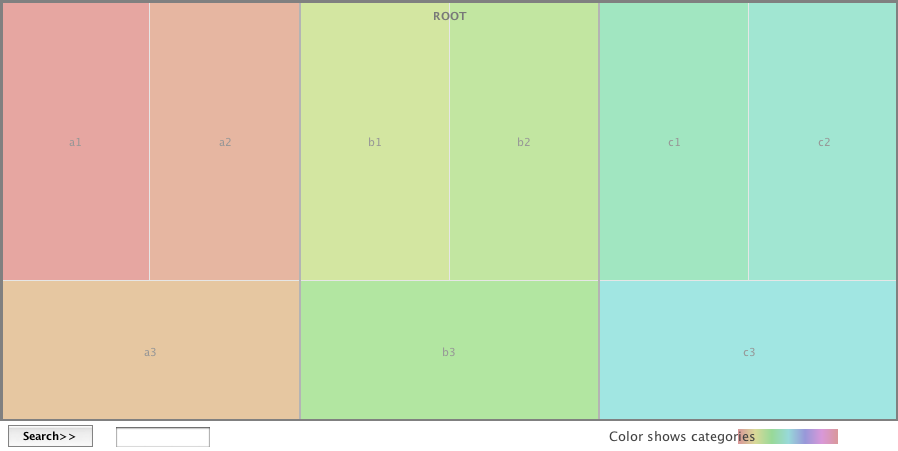
If the 100MB was evenly distributed across all the 3rd level directories, the treemap would look like this:
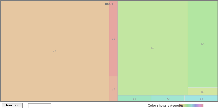
However, if the distribution was not uniform, the treemap will show us (using area) which directories use a disproportionate amount of space:
In the above graphic, we see that a3 is consuming 50% of the total area, while b2 and b3 consume 30% and 12% respectively. If this was a picture of my hard drive, I’d know to concentrate my file deletion efforts in directory a3 first, then b2 and so on.
Parallel Sets
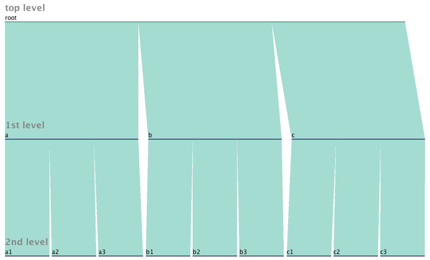
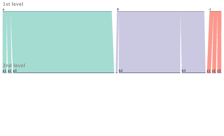
An interesting data visualization technique called Parallel Sets offers (perhaps) a more flexible alternative to the treemap for representing the breakdown of a data set by categories. Let’s use the same directory example as above. A Parallel Sets view of the evenly distributed case might look something like this:
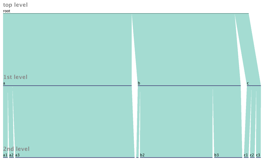
This view shows higher level directories as an aggregation of their sub-directories – a nice effect that is less obvious in the treemap approach. The effect even more pronounced in the asymmetric example (using the same values as the treemap above):
Looking at this view, I can clearly see that a3 and b2 are the low hanging fruit in my search for space hogs. We can eliminate the root level directory since it doesn’t add much value:
Adding more dimensions
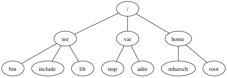
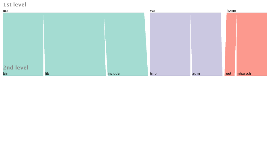
At this point It’s probably a toss-up as to which approach is better. Both pictures answer the original question about which directories are contributing most to the space consumption problem. The treemap however is reaching it’s limits in terms of expressing more data, whereas the parallel sets are just getting warmed up. Let’s switch to a slightly more realistic directory tree example:
Let us also change our original question and instead consider file count instead of file size as the unit of measure. The resulting pictures would look similar, except wider ribbons mean more files rather than more space consumed.
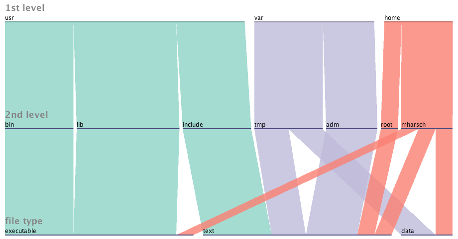
Now let’s add the dimension “file type” where type {executable, data, text}.
Now we can see the data both converge and fan-out according to the extra property that we’ve specified. From the diagram, we can learn the following:
- The contents of /usr/bin and /usr/lib are all executable, while /usr/include is all text
- /var/tmp has text and data files, while /var/adm is all text
- User ‘mharsch’ has a bit of everything in his home directory, while user ‘root’ has just text.
This same layering can be done with any attribute that is categorical (i.e. fits into a discrete number of buckets). Imagine breaking down all files by when they were last accessed (hour, day, week, month, year). Or bucketizing file size to see which directories contain many small files vs few large files.
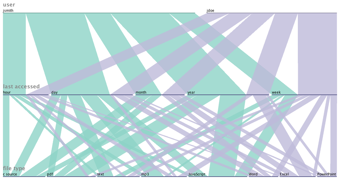
Since the data is independent of the filesystem hierarchy, we don’t have to constrain ourselves to the tree view if it doesn’t make sense for the arbitrary question we want to ask. For example, if we want to know the relative breakdown of files owned by user ‘jsmith’ vs ‘jdoe’ broken down by file type and access history, we might end up looking at a picture like this:
By altering the order of specified attributes, you can greatly affect the complexity of the resulting image. By choosing the variable “file type” followed by “last accessed” and finally “user”, we get a much busier (and less helpful) visual:
Going beyond the filesystem
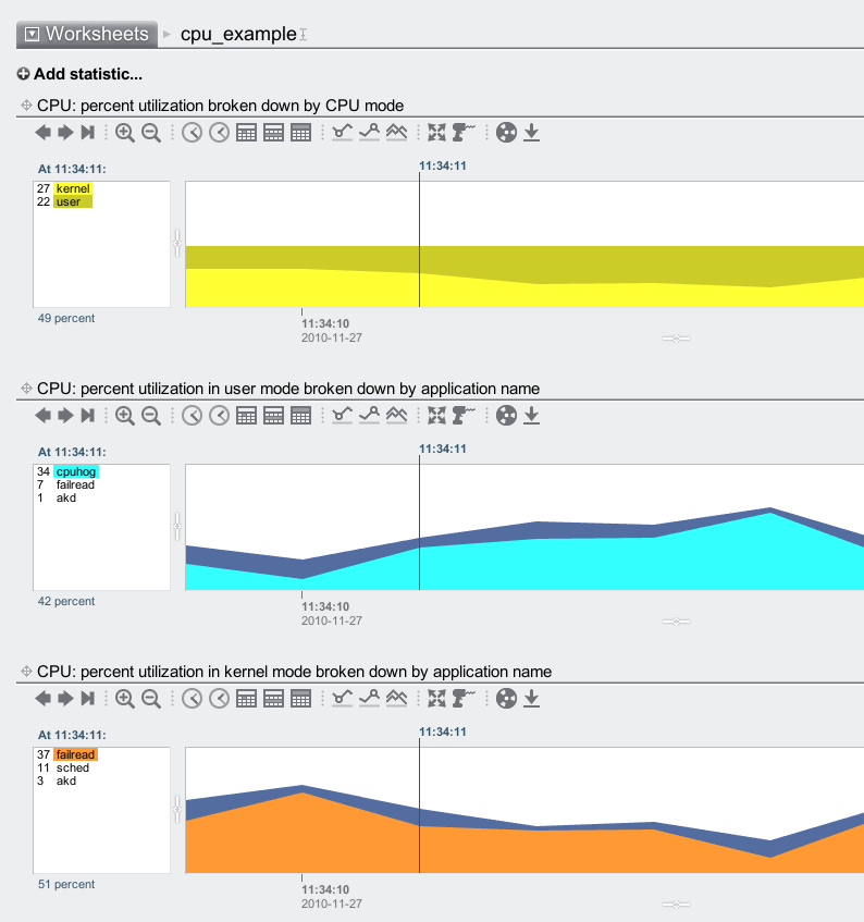
Since computer systems are full of related, categorical data – why constrain ourselves to the filesystem? Let’s look at a measurement of cpu utilization over a certain interval. During the measurement, 2 processes were running: cpuhog and failread. Each process spent some of it’s time in user mode and some in kernel mode. If we wanted to get a graphical sense of how the cpu spent it’s time during the interval, we could use combinations of stacked time-series graphs (the approach used by Analytics{.broken_link}):
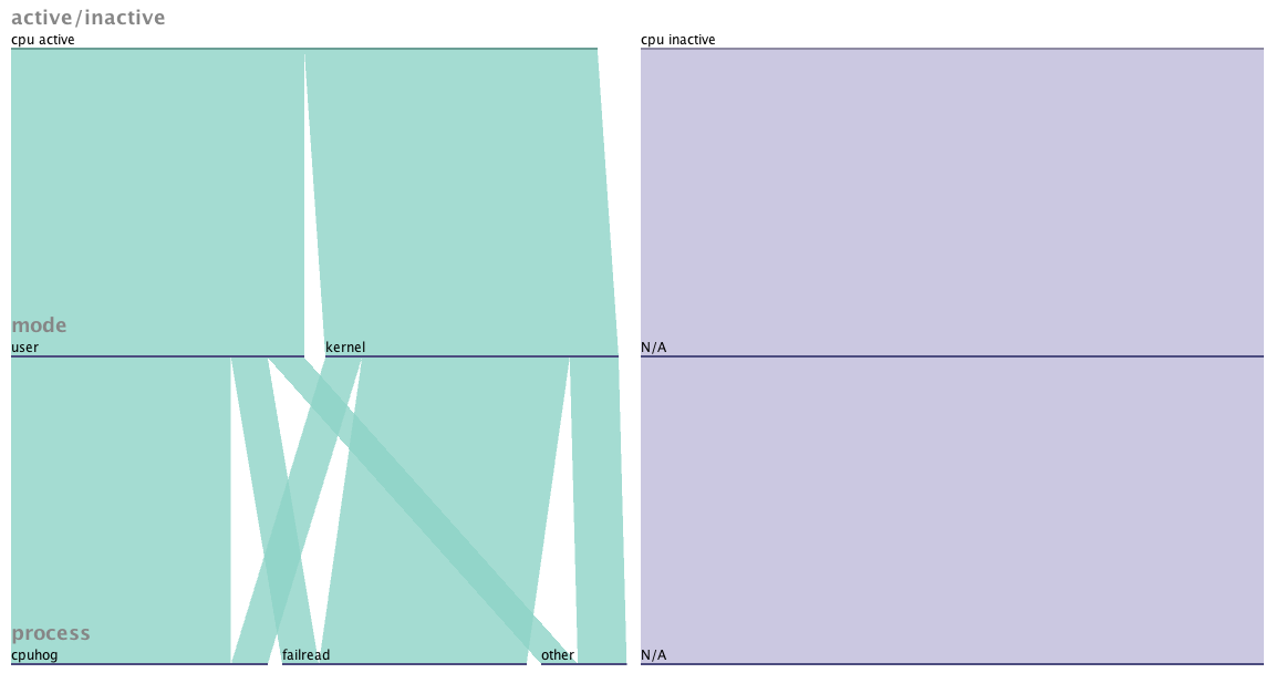
Or we could apply our new tool Parallel Sets to the problem and get something like this:
Both visuals tell the story that cpuhog spends most of it’s time running in user mode, while failread is spending most if it’s time in kernel mode. The Analytics version puts the data in the context of a timeline, while the parallel sets image does not. For the purposes of spotting trends over time, the Analytics version would be the way to go. If a historical context wasn’t important (say, for a point-in-time snapshot) the parallel sets view may be a stronger choice, since it combines the data into one graph and uses slightly less ink.
Conclusion
I think Parallel Sets has a future in visualizing certain aspects of computer systems. The tools available now are primitive (only accepting CSV data, and not allowing empty fields), but I think the tool is powerful enough that developers will be compelled to integrate it into their GUIs.
Update (1/1/2011): I just realized that the filesystem hierarchy diagrams (which were png files created using GraphVis) were not showing up on IE or Firefox. I’ve fixed these files, and they should work on all browsers now. If you read this post before using a browser other than Safari, you missed out on 2 diagrams. My apologies.

